
Prepare to be amazed as we delve into the fascinating world of typography design, where every letter and every space holds the power to captivate and communicate. From the history of typography to the impact of technology, we will explore the intricacies of selecting the perfect fonts, aligning text with precision, and creating visually stunning designs. But that’s not all – we will also reveal the secrets behind standard fonts, the art of font pairing, and the diverse applications of typography in various mediums. Get ready to embark on a journey that will forever change the way you see and appreciate typography.
History of Typography Arrangement
In the fascinating history of typography arrangement, designers have continuously explored and refined the art of arranging letters and text to create visually captivating and impactful designs. The evolution of arrangement has been shaped by influential typographers, cultural influences, the impact of the printing press, and contemporary trends.
Throughout history, typography arrangement has undergone significant changes. In the early days, scribes meticulously handcrafted each letter, resulting in meticulous and ornate designs. However, with the invention of the printing press in the 15th century, typography became more accessible to the masses. This technological advancement revolutionized the field, allowing for the mass production of books and printed materials.
Influential typographers such as Johannes Gutenberg and William Caxton played a crucial role in shaping the evolution of typography arrangement. They developed standardized typefaces and established conventions for letter spacing, line spacing, and overall page layout. Their contributions laid the foundation for the rules and principles that are still followed today.
Cultural influences also played a significant role in typography arrangement. Different cultures and time periods have embraced distinct typographic styles, reflecting their unique aesthetics and values. For example, the Art Nouveau movement in the late 19th and early 20th centuries introduced intricate and flowing typography, while the Bauhaus movement emphasized simplicity and functionality.
The impact of the printing press cannot be overstated in the history of typography arrangement. With the ability to reproduce text quickly and efficiently, designers had the freedom to experiment with different layouts and styles. This led to the emergence of new typographic trends and techniques.
In contemporary times, typography arrangement has been influenced by various factors, including advancements in technology and changes in design trends. The digital age has brought about new possibilities for typography, with designers exploring innovative layouts and interactive experiences. Additionally, the rise of minimalism and simplicity in design has resulted in clean and concise typographic arrangements.
The history of typography arrangement is a testament to the creativity and adaptability of designers. From the early days of handcrafted lettering to the digital age of experimental layouts, the evolution of arrangement continues to shape the way we communicate and experience visual design.
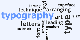
Typography Design Terms and Concepts
As we dive deeper into the world of typography, let’s explore the essential terms and concepts that are fundamental to typography design. Understanding these concepts will help you create visually appealing and effective designs.
First, let’s talk about typographic anatomy. This refers to the different parts of a letter, such as the stem, bowl, ascender, and descender. Knowing these terms will help you understand how letters are constructed and how they interact with each other.
Next, let’s discuss typographic styles. There are various styles of typefaces, including serif, sans serif, script, and display. Each style has its own unique characteristics and conveys a different mood or tone.
Typographic hierarchy is another important concept. It refers to the arrangement of different elements in a design to create a visual hierarchy. This helps guide the reader’s attention and emphasizes important information.
Alignment Techniques in Typography
Alignment techniques in typography play a vital role in creating visually balanced and harmonious designs. Understanding the rules of alignment is essential for achieving professional and polished typography. One important consideration is avoiding typographic illusions, such as the appearance of uneven spacing or misalignment. To ensure consistency and precision, designers must carefully adjust tracking and kerning. Tracking refers to the adjustment of overall space between letters, while kerning involves modifying the space between individual letters. By mastering these techniques, designers can create text that is both visually appealing and easy to read.
Technology has had a significant impact on alignment in typography. With the advent of digital tools, designers now have access to advanced features that simplify the alignment process. These tools allow for precise control over spacing and alignment, ensuring that each element is positioned accurately. Additionally, technology has also enabled the creation of various font pairings, expanding the possibilities for creative typography designs.
When selecting font pairings, it is important to consider how different typefaces complement each other. By combining visually different fonts, designers can create contrasting and impactful designs. Pairing serif and sans-serif typefaces, or combining bold and regular styles within one typeface, can add visual interest and create a harmonious balance. Ultimately, alignment techniques and font pairings work together to create typography that is visually appealing, communicates effectively, and enhances the overall design.
Spacing Adjustments in Typography Design
To achieve optimal spacing in typography design, precise adjustments are necessary to ensure the perfect balance between letters, words, and lines of text. The way you space your typography can greatly impact the overall aesthetic and readability of your design. Here are some key techniques and rules to consider when adjusting spacing in typography:
- Tracking Techniques: Tracking refers to the adjustment of overall space between letters. By increasing or decreasing the tracking, you can create different visual effects and improve legibility.
- Kerning Rules: Kerning involves modifying the space between individual letters to achieve a visually pleasing and harmonious arrangement. Careful kerning can prevent awkward gaps or collisions between letters.
- Leading Adjustments: Leading refers to the distance between two lines of text. Adjusting the leading can impact the readability and flow of the text, especially in longer paragraphs or body copy.
- Spacing in Headlines: Headlines require special attention to spacing to create impact and visual hierarchy. The spacing between words and letters in headlines can help draw the reader’s attention and make a statement.
- Typographic Balance: Achieving balance in your typography design is crucial. The spacing between letters, words, and lines should be carefully adjusted to create a harmonious composition that is visually appealing and easy to read.
Impact of Technology on Typography Arrangement
The advancement of technology has revolutionized the way typography is arranged, allowing for greater accessibility, efficiency, and the creation of diverse typefaces and styles. Digital advancements have transformed the field of typography, bringing in modern design techniques and automated layout tools that have significantly impacted visual communication. With the evolution of typography, designers now have access to a wide range of digital tools that streamline the process of arranging type, making it faster and more efficient. These automated layout tools enable designers to experiment with different typefaces, sizes, and arrangements, giving them the freedom to explore new creative possibilities. The impact of technology on typography arrangement is evident in the vast array of typefaces and styles that are now available. Designers can choose from a multitude of fonts and customize them to suit their specific design needs. This has led to a more diverse and dynamic typography landscape, where designers can create visually engaging and impactful designs. Overall, technology has played a crucial role in shaping the way typography is arranged, opening up new possibilities and pushing the boundaries of design.
Importance of Standard Fonts in Typography
With the impact of technology on typography arrangement, it is essential to understand the importance of using standard fonts in order to maintain readability, visual consistency, and overall design effectiveness. Standard fonts selection ensures that your text is easily legible and accessible to your audience. Readability considerations should be a top priority when choosing fonts, as decorative fonts can be harder to read and may distract from the message you are trying to convey. By sticking to standard fonts, you can ensure that your typography remains visually appealing and professional. Additionally, the relevance of decorative fonts should be carefully considered, as they may not always align with the tone and style of your design. Lastly, font pairs play a crucial role in creating visual interest and hierarchy. By combining visually different fonts, you can create contrast and enhance the overall design. In summary, using standard fonts is key to maintaining readability, visual appeal, and consistency in typography.
Creating Effective Font Pairs in Typography Design
Creating visually appealing and harmonious font pairs is a crucial aspect of effective typography design. Font pairing involves selecting two fonts that complement each other and create a sense of visual contrast. By combining different font styles, you can achieve a harmonious and balanced composition that enhances the overall design. When choosing font pairs, it is important to consider the visual contrast between the fonts. This can be achieved by combining serif and sans serif typefaces, or by combining bold and regular or light styles within the same typeface.
The key to creating effective font pairs is to find combinations that work well together. Look for fonts that have one or two attractive attributes that complement each other. For example, pairing a bold and geometric sans serif font with a delicate and elegant serif font can create a visually interesting contrast. Experiment with different combinations and see how they work together in the context of your design. Remember to consider the overall aesthetics and purpose of your design when selecting font pairs.

