
Prepare to be amazed as we delve into the three fundamental color theories that lay the groundwork for understanding the captivating realm of color. These theories will not only enhance your understanding of color relationships, but also empower you to create visually stunning designs. So, without further ado, let’s embark on this enlightening journey and discover the three basic color theories that will revolutionize the way you perceive and utilize color.
The Color Wheel
The color wheel serves as a fundamental tool in understanding and organizing the relationships between colors, providing a logical structure for artists and designers to create visually harmonious compositions. It is the basis of color theory and plays a significant role in various fields such as color psychology, color symbolism, color trends, color perception, and color in branding.
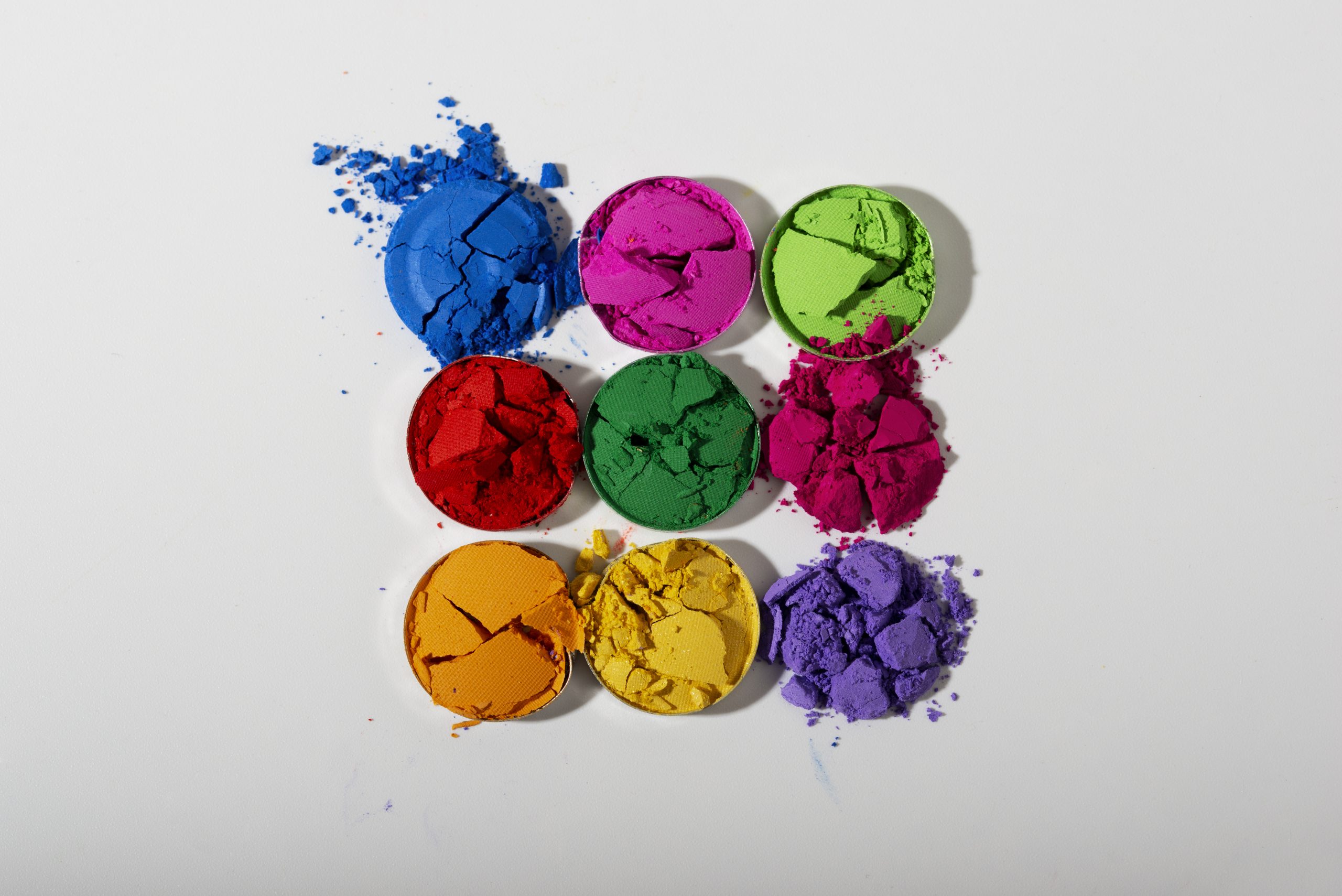
The color wheel is a circular representation of colors, with the primary colors, red, yellow, and blue, forming the basis. These primary colors cannot be created by mixing other colors and are the building blocks for all other colors on the wheel. By mixing the primary colors, secondary colors such as green, orange, and purple are created. And by mixing a primary color with a secondary color, we get tertiary colors like blue-green, red-violet, and yellow-orange.
Understanding the color wheel is crucial for achieving color harmony in design. Color harmony refers to the pleasing arrangement of colors that creates a sense of order and balance. By using techniques like analogous colors (colors next to each other on the wheel) or complementary colors (colors directly opposite each other on the wheel), designers can create visually appealing compositions. Color harmony is essential in branding and marketing, as different colors evoke different emotions and can greatly influence consumer perception and decision-making.
Primary Colors and Mixing
To understand how colors are created and mixed on the color wheel, it is essential to explore the concept of primary colors and their role in color theory. Primary color theory forms the foundation of color mixing techniques and understanding color perception. The primary colors, which are red, yellow, and blue, cannot be formed by any combination of other colors. They are the building blocks from which all other colors are derived. By mixing primary colors, secondary colors such as green, orange, and purple are created. Tertiary colors, on the other hand, are formed by mixing a primary color with a secondary color, resulting in two-word names like blue-green or red-violet.
Understanding primary colors and their mixing techniques is crucial in various aspects, including the importance of color in branding and the psychology of color choices. Color perception plays a significant role in attracting customers, with 90% of a consumer’s decision about a product based on color. Brands need to recognize the impact of color and make informed decisions when choosing the color of their logo or product. The emotions and psychology behind color choices can evoke specific responses from consumers, influencing their purchasing decisions. Poor color choices can have a negative impact on sales and brand perception. Therefore, a solid understanding of primary color theory and its applications in color mixing and branding is vital for effective marketing strategies.
Secondary Colors and Their Formation
Mixing primary colors together creates secondary colors, which are an essential part of color theory and provide a greater range of hues for artistic and design purposes. Understanding the formation of secondary colors is key to creating harmonious color schemes and enhancing color perception. Here are three important aspects of secondary colors:
- Formation of secondary colors: Secondary colors are formed by mixing two primary colors together. When red and yellow are mixed, orange is created. Mixing red and blue produces purple, while combining yellow and blue results in green. These secondary colors expand the color palette and offer a wider range of options for artistic expression.
- Role of secondary colors in color harmony: Secondary colors play a crucial role in achieving color harmony. They can be paired with complementary colors or used in analogous color schemes to create visually pleasing combinations. Secondary colors provide balance and contrast, adding depth and interest to designs.
- Significance of secondary colors in color perception: Secondary colors have a significant impact on how we perceive and interpret colors. They can influence the mood and emotions that a design evokes. The strategic use of secondary colors can enhance the overall aesthetic appeal and effectiveness of branding and marketing efforts.
Tertiary Colors and Their Two-Word Names
After understanding the formation and significance of secondary colors, it is essential to explore the world of tertiary colors and their unique two-word names. Tertiary colors are formed by mixing a primary color with a secondary color, resulting in a wide range of vibrant hues. These colors add depth and complexity to the color wheel, providing a greater variety of options for design and artistic expression.
One example of a tertiary color is blue-violet, which is created by mixing blue (primary) with purple (secondary). This color combines the calming qualities of blue with the richness and depth of purple, creating a visually appealing hue. Another example is yellow-green, formed by mixing yellow (primary) with green (secondary). This color captures the freshness of green with the energy and brightness of yellow.
Red-orange is another captivating tertiary color, achieved by mixing red (primary) with orange (secondary). This color combines the warmth and intensity of red with the vibrancy and playfulness of orange. Blue-green is a unique tertiary color that blends the tranquility of blue with the rejuvenating qualities of green. Lastly, yellow-orange is a lively tertiary color created by mixing yellow (primary) with orange (secondary), resulting in a cheerful and vibrant hue.
Understanding the names and formation of tertiary colors allows for more nuanced and sophisticated color palettes. By incorporating these colors into your designs or artwork, you can create visually striking compositions that evoke specific emotions and captivate the viewer.
Color Harmony and Its Importance
Color harmony plays a crucial role in creating visually appealing designs and captivating the viewer’s attention. When it comes to branding and marketing, understanding the importance of color harmony is essential for successful campaigns. Here are three reasons why color harmony is vital in this context:
- Importance of color harmony in branding and marketing: The colors used in branding have a significant impact on how consumers perceive a product or service. The right color choices can evoke specific emotions and create a strong brand identity. By using color harmoniously in branding, businesses can effectively communicate their message and attract their target audience.
- The psychology of color choices: Different colors have the power to evoke specific emotions and influence consumer behavior. For example, red is often associated with energy and excitement, while blue conveys trust and calmness. Understanding the psychology behind color choices allows marketers to strategically select colors that align with their brand values and desired consumer response.
- The impact of poor color choices on sales: Using colors that clash or do not align with the desired brand image can have a negative impact on sales. Consumers may perceive the product as unprofessional or unappealing, leading to a loss of interest and potential sales. By carefully considering color harmony, businesses can avoid this pitfall and create a positive visual experience for their customers.
Analyzing competitors’ color strategies and understanding the emotions evoked by different colors are crucial steps in achieving effective color harmony in branding and marketing. By doing so, businesses can create visually appealing designs that resonate with their target audience and ultimately drive sales.
Formulas for Achieving Color Harmony
To achieve color harmony in design, it is essential to utilize specific formulas that guide the selection and arrangement of colors. These formulas act as a framework for creating visually appealing and balanced compositions. Color harmony techniques can be applied to both natural and designed environments, allowing for a cohesive and pleasing aesthetic.
In nature, color harmony can be observed in the vibrant hues of flowers, the rich tones of a sunset, or the contrasting colors of a landscape. By studying these harmonious combinations, designers can gain inspiration and apply similar principles to their own work. However, achieving color harmony without formulas can be challenging, as it requires a deep understanding of color relationships and a keen eye for balance.
In design, color harmony is crucial for creating engaging and visually appealing compositions. One commonly used formula is the use of analogous colors, which are three colors that are adjacent to each other on the color wheel. These colors share similar hues and create a harmonious and unified color scheme. Another formula is the use of complementary colors, which are two colors that are opposite each other on the color wheel. These colors create a dynamic contrast and make certain elements stand out.
While formulas provide a structured approach to achieving color harmony, dynamic color harmony can also be explored through experimentation and intuition. This involves exploring unconventional color combinations and pushing the boundaries of traditional color theories. By embracing creativity and thinking outside the box, designers can create unique and visually striking compositions.
Color Context and Its Influence on Perception
As we continue our exploration of color theories, let’s now delve into the fascinating world of color context and its profound influence on perception. Understanding how color interacts with its surroundings is crucial in various aspects, including branding, marketing, and design. Here are three key points to consider regarding color context:
- Color Contrast: The contrast effects of different background colors can significantly impact how a color appears. Colors can appear more vibrant or subdued depending on the background they are placed against. The right color contrast can make an element stand out or blend harmoniously with its surroundings.
- Relativity of Color: Our perception of color is relative and influenced by the colors around it. This means that the same color can appear different depending on the colors it is paired with. It is essential to consider how different colors interact and influence each other to create the desired visual impact.
- Color Perception in Branding: Color plays a crucial role in branding and marketing. People make quick decisions about products, with color being a significant factor in their choices. Understanding the emotions and psychology behind color choices can help evoke desired responses from consumers. Analyzing competitors’ color choices can provide insights into effective branding strategies.

