
As you sit down to design your latest project, have you ever wondered why certain colors evoke certain emotions or how they can influence the way your audience perceives your work? The use of color theory in graphic design holds the answers to these questions and more. By understanding the principles of color theory, you can harness the power of color to create visually stunning designs that effectively communicate your intended message. But what exactly is color theory and how does it impact graphic design? Let’s explore this fascinating subject together and unlock the secrets behind the use of color theory in graphic design.
Importance of Color Theory
Understanding the importance of color theory is essential for creating visually appealing and impactful designs in graphic design. Color theory is not just about choosing pretty colors; it is a powerful tool that can be applied in various aspects of design, including branding, web design, and advertising. By understanding color theory principles and applications, you can create designs that effectively communicate your message and evoke the desired emotions in your audience.
In branding, color theory plays a crucial role in establishing brand identity and recognition. Different colors have different psychological associations and can convey specific messages about a brand’s values and personality. By strategically selecting colors that align with your brand’s message, you can create a cohesive and memorable brand identity.
In web design, color theory helps in creating visually pleasing and user-friendly interfaces. Colors can guide users’ attention, differentiate elements, and create hierarchy. By understanding color theory, you can choose colors that optimize users’ experience and convey the desired mood or message on your website.
In advertising, color theory is used to capture attention and evoke emotions. Colors can influence consumers’ perceptions and affect their purchasing decisions. By applying color theory principles in advertising, you can create eye-catching and persuasive designs that effectively communicate your product or service’s benefits.
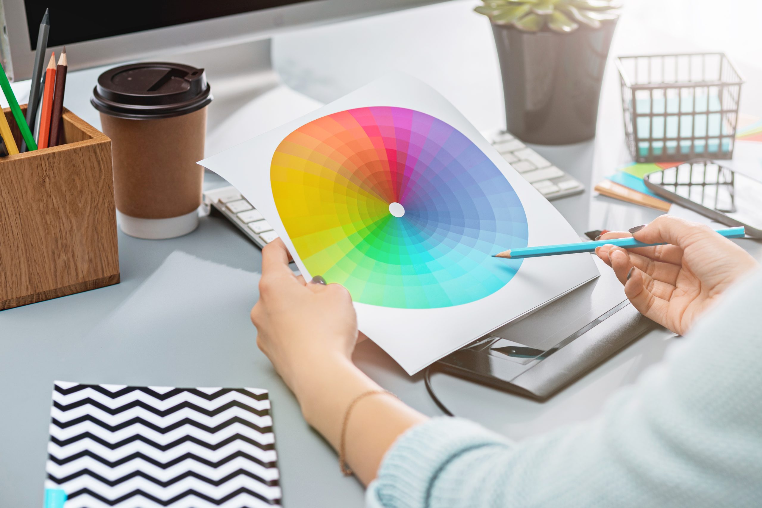
The Color Wheel and Its Components
The color wheel, a fundamental tool in graphic design, visually represents the relationships between different colors. It consists of primary colors, secondary colors, and tertiary colors, which are all crucial in understanding color relationships and creating harmonious designs. Here is a table that provides a visual representation of these color components:
| Primary Colors | Secondary Colors | Tertiary Colors |
|---|---|---|
| Red | Orange | Red-Orange |
| Blue | Green | Blue-Green |
| Yellow | Violet | Yellow-Green |
| Yellow-Orange | ||
| Blue-Violet |
Primary colors, including red, blue, and yellow, are the foundation of all other colors. Secondary colors, such as orange, green, and violet, are created by mixing equal parts of primary colors. Tertiary colors, like red-orange, blue-green, etc., are formed by mixing a primary color with a neighboring secondary color on the color wheel.
Understanding the color wheel and its components is essential in graphic design as it helps designers select colors that work well together and create color harmony. By utilizing the relationships between primary, secondary, and tertiary colors, designers can achieve visually appealing and balanced compositions. The color wheel serves as a guide for creating color schemes, such as complementary, analogous, and triadic, which further enhance the overall impact of the design. By mastering the color wheel and its components, designers can create visually stunning and harmonious designs that effectively communicate their intended messages.
Color Harmonies and Effects
Now let’s explore the captivating world of color harmonies and the powerful effects they have on graphic design. Color combinations play a significant role in creating visual impact and conveying messages effectively. By understanding color symbolism, designers can strategically use colors to evoke specific emotions and associations. Color contrast is another important aspect of color harmonies, as it helps create visual interest and hierarchy in designs. By using contrasting colors, designers can draw attention to important elements and make them stand out.
Color psychology is also a crucial factor to consider when applying color theory in graphic design. Different colors have different psychological effects on viewers. For example, warm colors like red and orange are often associated with energy and excitement, while cool colors like blue and green are associated with calmness and relaxation. By understanding these psychological effects, designers can choose colors that align with the intended message and create the desired emotional response.
Applying Color Theory in Graphic Design
To create visually captivating designs in graphic design, applying color theory is essential. By understanding color theory principles and incorporating them into your design process, you can create designs that effectively communicate your message and evoke the desired emotional response. Color theory plays a crucial role in various aspects of graphic design, including branding, web design, advertising, and packaging design.
In branding, color theory helps establish a strong brand identity by selecting colors that align with the brand’s personality and values. Different colors evoke different emotions, so it’s important to carefully choose colors that resonate with your target audience.
In web design, color theory guides the selection of colors for different elements of a website, such as buttons, backgrounds, and text. By using color harmonies and contrasts, you can create visually appealing and user-friendly interfaces.
In advertising, color theory is used to attract attention and create a memorable visual impact. By understanding the psychological effects of colors, you can effectively communicate the message and influence consumer behavior.
In packaging design, color theory helps create packaging that stands out on the shelves and conveys the product’s qualities. Colors can evoke a sense of freshness, luxury, or playfulness, depending on the desired effect.
Understanding Color Psychology
Understanding the psychology of color is essential for graphic designers to create impactful and engaging designs that resonate with their target audience. Color has a profound psychological impact on individuals, influencing their emotions, perceptions, and overall experience with a design. By understanding color psychology, designers can harness the power of color symbolism and create strong emotional connections with their audience.
Color associations play a significant role in color psychology. Different colors evoke specific emotions and have cultural and societal meanings attached to them. For example, red is often associated with passion and energy, while blue conveys calmness and trust. By strategically using colors that align with the desired emotional response, designers can evoke the intended feelings in their audience.
Color perception also plays a crucial role in color psychology. People have different preferences and interpretations of colors based on their personal experiences, culture, and individual characteristics. Designers must consider these factors when selecting colors for their designs to ensure that they resonate with their target audience.
Choosing Color Schemes
When selecting color schemes for your designs, it’s important to consider the emotional impact and cultural associations of different colors. Color symbolism and color psychology play a significant role in understanding how colors can evoke specific emotions and convey messages. For example, red is often associated with passion and energy, while blue conveys calmness and trust. By understanding the emotional impact of colors, you can choose color combinations that align with the intended mood or message of your design.
In addition to emotional impact, color contrast is also crucial in choosing color schemes. Contrast refers to the difference in brightness, saturation, or hue between colors. By using contrasting colors, you can create visual interest and ensure that important elements stand out. For example, pairing a bright, saturated color with a muted, desaturated color can create a strong contrast.
When selecting color combinations, it’s important to consider color harmony. Color harmony refers to the pleasing and balanced arrangement of colors. Different color harmonies, such as complementary, analogous, or triadic, can be used to create different effects in your design. Complementary colors, located opposite each other on the color wheel, create high contrast and eye-catching designs. Analogous colors, on the other hand, are adjacent to each other on the color wheel and create a sense of harmony.
Impact of Color Theory in Graphic Design
Color theory has a profound impact on the world of graphic design, influencing the effectiveness and visual appeal of designs in various mediums. Understanding the psychological impact of color is essential in graphic design, as different colors evoke different emotions and perceptions in viewers. By strategically applying color theory principles, designers can effectively use visual storytelling to convey messages and create an emotional connection with their audience.
Color theory also plays a vital role in establishing brand identity. By selecting specific colors that align with a brand’s values and personality, designers can create a cohesive and recognizable visual identity that resonates with consumers. Additionally, color choices have a direct impact on the user experience. Designers must consider the usability and accessibility of their designs by taking into account factors such as color contrast and designing for color blindness.
Furthermore, color symbolism is an important aspect of graphic design. Different colors carry symbolic meanings and cultural associations, which can be used to enhance the message and impact of a design. By understanding and utilizing color symbolism, designers can create designs that effectively communicate their intended message and resonate with their target audience.

