
Look no further, as we delve into the do’s and don’ts of typography to help you level up your design skills. Picture this: you’ve carefully chosen a typeface that perfectly reflects the brand’s personality, but did you consider the importance of consistency in maintaining a clear brand identity? In this discussion, we will explore the key aspects of typography, from selecting the right typeface to understanding the power of white space, all while keeping your audience captivated. So, let’s dive in and uncover the secrets behind creating stunning and effective designs that leave a lasting impression.
Choosing the Right Typeface
When choosing the right typeface, it is crucial to consider the brand intent and select a typeface that aligns perfectly with it. Typography trends are constantly evolving, so it’s important to stay updated and choose a typeface that reflects current design aesthetics. Legibility considerations should also be taken into account, as the readability of the text is essential for effective communication. Font pairing techniques can add depth and visual interest to the design, but it’s important to choose typefaces that complement each other and create a harmonious composition. When selecting a typeface, keep in mind the overall brand identity and choose a typeface that aligns with it. Additionally, the importance of kerning should not be overlooked. Proper kerning, which is the adjustment of space between letters, can greatly enhance the legibility and visual appeal of the text. Pay attention to the details and make sure the kerning is consistent throughout the design. By considering these typography trends, legibility considerations, font pairing techniques, typeface selection tips, and the importance of kerning, you can create visually appealing and effective typography designs that align perfectly with your brand intent.
Maintaining Consistency in Typefaces
To maintain a cohesive and professional appearance in your typography designs, it is essential to ensure consistency in your choice of typefaces. Consistency in typefaces not only creates a visually appealing design but also contributes to readability and accessibility. In the ever-evolving world of typography trends, it is important to follow typeface selection guidelines that align with the purpose of the design and the branding. When selecting typefaces for branding, consider the overall aesthetic and tone that you want to convey. Additionally, pay attention to readability by choosing typefaces that are easy to read in different contexts, such as digital screens or print. Whitespace plays a crucial role in typography, and maintaining consistency in spacing can greatly enhance the legibility and overall design. By maintaining consistency in your choice of typefaces, you create a strong visual identity and ensure that your typography designs effectively communicate your message to the audience.
Enhancing Readability With Inclusive Design
Enhance the readability of your typography designs by incorporating inclusive design principles. When it comes to typography accessibility, there are several readability techniques you can implement to make your designs more inclusive. Here are some inclusive design tips to improve legibility:
- Choose legible typefaces: Select fonts that are easy to read, especially for people with visual impairments. Sans-serif fonts like Arial or Open Sans are often preferred for their clean and straightforward design.
- Optimize font size and spacing: Ensure that your typography is large enough to be read comfortably, especially on smaller screens. Adequate spacing between letters, words, and lines of text also contributes to improved legibility.
- Consider color contrast: Use color combinations that provide sufficient contrast between the text and background. This helps individuals with visual impairments or color vision deficiencies to read the content more easily.
Mixing Serif and Sans-Serif Typefaces for Variety
Mixing serif and sans-serif typefaces can add variety and visual interest to your typography designs. By combining bold and italic fonts, you can create emphasis and highlight important text within your layout. Experimenting with different font sizes allows you to create hierarchy and guide the reader’s attention. Additionally, exploring decorative typefaces can add a unique flair to your design, making it stand out from the crowd.
Color is another powerful tool that can enhance your typography. By using color strategically, you can create contrast, highlight important information, and evoke specific emotions. Incorporating texture into your typography adds depth and dimension to your design, making it more visually appealing.
When mixing serif and sans-serif typefaces, it’s important to maintain balance and cohesion. Consider using a bold sans-serif font for the main title, while opting for a serif font for the body copy. This contrast helps differentiate different sections of your project and enhances the overall visual appeal.
Utilizing White Space for a Pleasant Reading Experience
When it comes to creating a pleasant reading experience, one important element to consider is the effective utilization of white space in your typography designs. Maximizing whitespace for optimal legibility is essential in ensuring that your text is easy to read and comprehend. It provides a visual break for the eyes and allows the content to breathe, preventing the reader from feeling overwhelmed.
The impact of line height on readability should not be overlooked. Adequate line spacing helps to create a balanced layout with proper text spacing. It ensures that each line of text is distinct and legible, allowing the reader to smoothly navigate through the content.
Utilizing typography to guide the reader’s flow is another key aspect of creating a pleasant reading experience. By strategically placing headers, subheadings, and body text, you can lead the reader from one section to another seamlessly. This helps to maintain their focus and engagement throughout the text.
Lastly, the role of font weight in enhancing readability cannot be ignored. Choosing the right font weight can greatly impact the legibility of your text. Opt for a font weight that is neither too thin nor too bold, striking the perfect balance between readability and aesthetics.
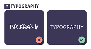
Avoiding Unaligned Text and Improper Spacing
To ensure a visually appealing and easy-to-read design, it is crucial to avoid unaligned text and improper spacing. Typography alignment and spacing techniques play a significant role in enhancing the readability and legibility of your text. Properly aligned text creates a sense of order and hierarchy, guiding the reader’s eye smoothly across the page. Improper spacing can make the text appear cramped or scattered, making it difficult to read and comprehend.
Here are some readability tips and typographic hierarchy techniques to help you avoid unaligned text and improper spacing:
| Typographic Hierarchy | Spacing Techniques | Readability Tips |
|---|---|---|
| Use headings and subheadings to establish hierarchy | Adjust kerning and tracking for optimal legibility | Choose font sizes that are appropriate for the content |
| Utilize bold and italics for emphasis | Leave adequate white space between paragraphs | Consider line height (leading) for comfortable reading |
| Vary font weights and sizes for visual interest | Use consistent spacing between lines and words | Avoid long lines of text for easier scanning |
| Align text elements with a grid system | Break up text with bullet points or numbered lists | Use appropriate contrast between text and background |
| Pay attention to the balance of text and images | Experiment with different spacing options to find the best legibility | Proofread for typos and errors to maintain professionalism |
Using Font Styles and Caps Sparingly for Emphasis
Use font styles and capitalization sparingly to effectively emphasize key elements in your design. Typography emphasis plays a crucial role in guiding the reader’s attention and conveying the intended message. To achieve this, here are some legibility tips and font psychology insights to consider:
- Font Combinations: Experiment with different font combinations to create visual interest and enhance the overall appeal of your design. Pairing a bold sans-serif font with a classic serif font can help differentiate sections and create a balanced composition.
- Modern Sentence Spacing: In modern typography, it is important to follow proper sentence spacing. Avoid using two spaces after every period, as it is outdated. Instead, use single spaces between sentences for improved readability and a clean, contemporary look.
- Psychological Impact: Fonts have the power to evoke specific emotions and set the mood of your design. Choose fonts that align with the intended effect you want to convey. For example, a playful script font may be suitable for a whimsical design, while a clean and minimal sans-serif font can convey a modern and professional tone.
Importance of Visual Hierarchy in Typography
Now let’s explore the significance of visual hierarchy in typography and how it contributes to the overall effectiveness of your design. Creating visual hierarchy is a key aspect of typography trends today. It involves arranging your text in a way that guides the viewer’s eye and emphasizes important information. By strategically varying font size, weight, and spacing, you can improve legibility and ensure that your message is easily understood.
Visual hierarchy plays a crucial role in enhancing the impact of your typography on brand identity. It allows you to establish a clear hierarchy of information, highlighting key elements such as headlines, subheadings, and call-to-action phrases. This not only improves readability but also reinforces your brand’s visual identity.
Color also plays a significant role in creating visual hierarchy in typography. By using color strategically, you can draw attention to specific elements, create contrast, and evoke certain emotions. For example, using a bold, contrasting color for headlines can make them stand out, while using a softer, complementary color for body text can create a harmonious balance.

