
Imagine a world devoid of color, where everything is just shades of gray. How dull and uninspiring would that be? Colors have the power to evoke emotions, communicate messages, and create visual harmony. But with so many colors to choose from, how do you know which ones fit together? In this discussion, we will explore the fascinating world of color combinations and uncover the secrets behind creating captivating and harmonious designs. So, get ready to unleash your creativity and discover the perfect color palettes that will make your designs come alive!
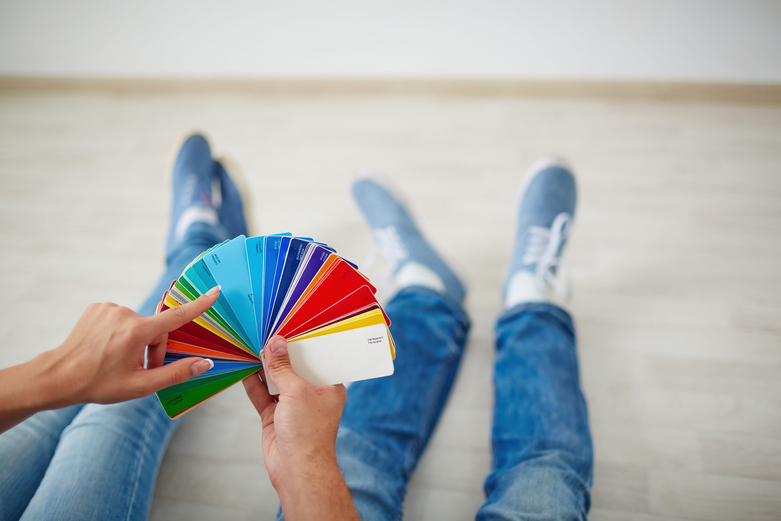
Color Theory Basics
Understanding the basics of color theory is essential for creating visually appealing designs that effectively communicate with your audience. Color psychology plays a significant role in how colors impact people’s emotions and behaviors. By exploring the impact of color in branding, you can strategically choose colors that align with your brand’s values and evoke the desired emotional response from your target audience. Moreover, the role of color in user interface design cannot be underestimated. Color choices can enhance usability, guide users’ attention, and create a cohesive and intuitive user experience.
Creating harmonious color palettes is key to achieving a visually pleasing design. By understanding the color wheel and color relationships, you can select colors that complement each other and create a sense of balance and unity. Consider using analogous color combinations, where colors adjacent to each other on the color wheel are used to create a harmonious effect.
It is important to note that color preferences can vary across different cultures. The influence of culture on color preferences should be considered when designing for a global audience. Colors can carry different meanings and symbolism in different cultures, so it is crucial to do thorough research and ensure that your color choices are culturally sensitive and appropriate.
Understanding these color theory basics will empower you to make informed design choices and create visually captivating designs that resonate with your audience.
Complementary Color Combinations
To create visually striking designs that catch the eye, explore the world of complementary color combinations. Complementary colors sit opposite each other on the color wheel, creating high contrast and capturing attention. They have a powerful impact in branding, as they can evoke specific emotions and associations in viewers. The psychology behind complementary color combinations is fascinating, as each pair of colors creates a unique visual experience. Understanding the impact of complementary colors is essential in effectively using them in graphic design. By strategically incorporating complementary colors, designers can create eye-catching visuals that leave a lasting impression on the audience.
In web design, there are numerous successful examples of complementary color schemes. For instance, the combination of blue and orange creates a vibrant and energetic look, making it a popular choice for websites that want to convey a sense of excitement and creativity. Another successful combination is purple and yellow, which creates a striking and regal look that is often used in luxury brands.
Analogous Color Combinations
Analogous color combinations, with their harmonious and balanced aesthetic, create a sense of visual cohesion and unity in design. Exploring the harmony of analogous color palettes allows you to discover the subtle nuances and variations within a color family. By using colors that are adjacent to each other on the color wheel, you can create depth and balance in your design. The psychology behind analogous color combinations suggests that they evoke a sense of tranquility and comfort, making them ideal for creating a soothing atmosphere. Enhancing your design with analogous color schemes involves choosing a dominant color and using the adjacent colors as accents or secondary elements. Tips for incorporating analogous colors into your brand identity include experimenting with different shades and tones within the color family, using contrasting textures to add visual interest, and considering the emotions and associations that each color evokes. By understanding the principles of analogous color combinations, you can create designs that are visually appealing and convey the desired message to your audience.
Triadic Color Combinations
By exploring the principles of analogous color combinations and the visual harmony they create, you can now delve into the world of triadic color combinations and unlock a vibrant and dynamic palette for your designs. Triadic color combinations are created by selecting three colors that are evenly spaced on the color wheel. This creates a sense of balance and energy in your design.
Using triadic color combinations in interior design can bring a sense of vibrancy and playfulness to a space. By incorporating three colors that are evenly spaced on the color wheel, you can create a visually striking triadic color palette that adds depth and interest to any room.
When it comes to graphic design, triadic color combinations can create eye-catching visuals that capture attention. By selecting three colors that are evenly spaced on the color wheel, you can create a dynamic composition that draws the viewer in.
The psychology behind triadic color combinations is that they create a sense of harmony and balance. The evenly spaced colors on the color wheel work together to create a visually appealing palette that is pleasing to the eye.
Incorporating triadic color combinations in branding and marketing can help create a memorable and impactful visual identity. By selecting three colors that are evenly spaced on the color wheel, you can create a cohesive and visually striking brand that stands out from the competition. Triadic color combinations have the power to evoke emotions and create a strong connection with the audience.
Tetradic Color Combinations
Tetradic color combinations offer a diverse and balanced palette that can bring a bold and harmonious look to your designs. Exploring the vibrancy of tetradic color combinations allows you to create visually striking and dynamic color schemes. The psychology behind tetradic color combinations is rooted in the use of four colors that are evenly spaced on the color wheel. This creates a sense of balance and harmony while still providing a vibrant and energetic feel.
To effectively use tetradic color combinations in branding, consider selecting colors that reflect the personality and values of your brand. With four colors to choose from, you have the opportunity to create a unique and memorable visual identity. In website design, tetradic color combinations can be used to create visually appealing and balanced palettes. By selecting colors from different areas of the color wheel, you can create contrast and interest while maintaining a cohesive look.
When creating a tetradic color palette, it is important to ensure that the colors are balanced and visually appealing. Consider using a dominant color and incorporating the other three colors as accents. This will create a harmonious composition that draws the viewer’s attention while maintaining a sense of cohesion. With tetradic color combinations, you have the flexibility to create bold and vibrant designs that leave a lasting impression.
Trending Color Combinations
One of the most popular and visually captivating aspects of contemporary design is the use of trending color combinations. Exploring the psychology behind these color combinations can provide valuable insights into their appeal and effectiveness. Understanding the impact of trending color combinations on user experience is crucial for creating engaging and visually appealing designs. By analyzing the cultural influences on these color combinations, designers can ensure that their choices resonate with their target audience.
In branding, using trending color combinations effectively can help create a strong and memorable brand identity. By understanding the role of color psychology in creating successful color combinations, designers can evoke specific emotions and associations that align with their brand values and messaging.
Trending color combinations often draw inspiration from current cultural trends and influences. By staying up-to-date with these trends, designers can create designs that feel fresh and relevant.
Classic Color Combinations
As we shift our focus from trending color combinations, let’s now explore the timeless appeal and versatility of classic color combinations. Classic color combinations have stood the test of time and continue to be popular in various design fields. Here are two sub-lists to engage you:
Sub-list 1:
- Classic color combinations have a deep-rooted history and are widely recognized and appreciated.
- These combinations often evoke a sense of familiarity and nostalgia, making them appealing to a wide range of audiences.
- Classic color combinations are carefully chosen to create a sense of harmony and balance.
- They have been used in various art forms, including painting, fashion, and interior design.
- Classic color combinations often have cultural or symbolic significance, adding depth and meaning to the design.
Sub-list 2:
- Classic color combinations are extensively used in branding to evoke specific emotions or associations.
- The psychology of color plays a significant role in branding, and classic combinations are carefully selected to align with the brand’s values and messaging.
- These combinations can convey qualities such as trust, elegance, sophistication, or playfulness, depending on the specific colors used.
- Classic color combinations are also popular in website design, as they create a timeless and visually appealing aesthetic.
- They can be used to establish a brand’s identity and create a strong visual impact on the audience.
Classic color combinations offer a sense of reliability and timelessness, making them an excellent choice for various design projects. By understanding the psychology of color and the principles of color harmony, you can effectively utilize classic combinations to create visually stunning and impactful designs.

