
So, you think you know how to apply color theory, huh? Well, let’s see if you’ve truly mastered the art of color manipulation. It’s not just about throwing random shades together and hoping for the best. No, there’s a science behind it, a method to the madness. In this discussion, we’ll unravel the secrets of applying color theory in a way that will leave your audience in awe. From understanding the color wheel to unlocking the power of complementary and analogous color harmonies, we’ll delve into the depths of color theory and reveal how it can elevate your creative endeavors to new heights. Get ready to step into a world where colors come alive and make a lasting impact. Are you ready to take your color game to the next level?
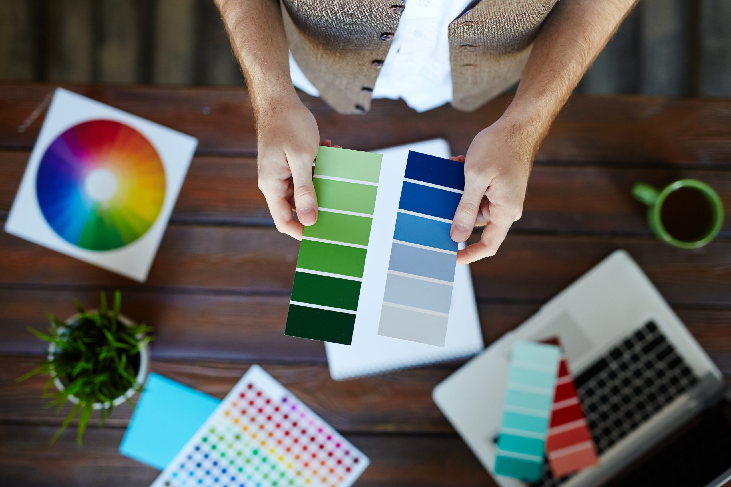
Understanding Color Theory Fundamentals
Understanding color theory fundamentals is essential for anyone involved in design, whether you’re an artist, graphic designer, or interior decorator. Color psychology, color perception, color symbolism, color combinations – these are all important aspects of color theory that can greatly impact your designs.
Color psychology refers to the study of how different colors affect human emotions and behavior. For example, warm colors like red and yellow can evoke feelings of energy and excitement, while cool colors like blue and green can create a sense of calmness and tranquility.
Color perception is the way our eyes and brain interpret colors. Our eyes have different receptors that respond to different wavelengths of colored light, and our brain processes these signals to create the perception of color.
Color symbolism is the cultural and personal associations we have with different colors. For instance, red can symbolize love and passion, while green can represent nature and growth.
Understanding color combinations is essential for creating visually pleasing designs. The color wheel is a useful tool that shows the relationships between colors and helps with color selection. Complementary colors, for example, are colors that are opposite each other on the color wheel and create a vibrant contrast when used together.
Exploring Color Harmonies for Design
Now that you have a solid understanding of color theory fundamentals, let’s explore the exciting world of color harmonies for design. Color harmonies are essential in creating visually appealing and cohesive designs. They can evoke specific emotions, convey messages, and enhance the overall aesthetic of a design. By understanding color symbolism and color psychology in design, you can strategically use color harmonies to create a desired impact.
One way to create a cohesive color palette is by using color theory in branding. By selecting colors that align with your brand’s values and personality, you can create a strong brand identity. Similarly, color theory plays a crucial role in website design. By using harmonious color combinations, you can create a visually pleasing and user-friendly website that enhances the user experience.
To help you explore different color harmonies, here is a table showcasing some popular color schemes:
| Color Harmony | Description |
|---|---|
| Monochromatic | Uses variations of a single hue by using tints, shades, and tones. |
| Analogous | Uses three colors next to each other on the color wheel. |
| Complementary | Combines two colors that are opposite each other on the color wheel. |
| Triadic | Uses three colors equally spaced on the color wheel. |
| Split-Complementary | Combines one color with two colors on the opposite side of the color wheel. |
| Tetradic | Involves choosing four colors that form a rectangle on the color wheel. |
Applying Color Theory to Interior Design
Color theory is a powerful tool that interior designers can use to create visually stunning and harmonious spaces. By understanding color psychology, you can strategically choose colors that evoke specific emotions and create the desired ambiance in a room. Creating focal points is another way to apply color theory in interior design. By using bold and contrasting colors, you can draw attention to specific areas or architectural features. Incorporating texture is also important. Different textures can enhance the visual interest of a space and add depth. Lighting considerations are crucial as well. The color of light can significantly impact how we perceive colors in a room, so it’s important to consider natural and artificial lighting sources when selecting colors. Lastly, achieving color balance is essential. Balancing warm and cool colors, as well as light and dark tones, creates a sense of harmony and cohesion in a space. By applying color theory principles, you can transform any room into a visually pleasing and harmonious environment.
Importance of Color Theory in Home Decor
When it comes to home decor, color theory plays a crucial role in creating a visually appealing and harmonious environment. Understanding color psychology and color symbolism can help you choose the right colors to evoke specific moods and emotions in different rooms of your home. Additionally, staying updated with current color trends can ensure that your home decor feels modern and stylish. Color palettes, which are carefully curated combinations of colors, can help you achieve balance and cohesion in your design. By using complementary colors, analogous colors, or other color schemes, you can create a sense of harmony and visual interest in your space. It’s also important to consider color balance, making sure that the distribution of colors is visually pleasing and doesn’t overwhelm the eye. By applying color theory principles to your home decor, you can create a space that not only looks beautiful but also feels inviting and reflects your personal style.
Basics of Color Theory in Interior Design
To effectively incorporate color theory into your interior design, it is essential to understand the basics of color theory and how it can be applied to create visually appealing and harmonious spaces. Color theory encompasses various aspects, including color psychology, color symbolism, color palette selection, color contrast, and color trends. Here is a table that summarizes these key elements:
| Aspect | Description |
|---|---|
| Color Psychology | Understanding how colors can evoke emotions and influence moods in a space. |
| Color Symbolism | Recognizing the symbolic meanings associated with different colors and their cultural context. |
| Color Palette Selection | Choosing a cohesive combination of colors that work well together in a design scheme. |
| Color Contrast | Creating visual interest and balance by using contrasting colors in a space. |
| Color Trends | Staying updated with current color trends to ensure a modern and fashionable design aesthetic. |
Tips for Using Color Theory in Design
Using color theory in design can elevate your projects and create visually captivating experiences. By understanding color psychology, color symbolism, color contrast, color palettes, and color trends, you can make intentional design choices that effectively communicate your message and evoke desired emotions in your audience.
Color psychology plays a crucial role in design. Different colors have distinct psychological effects, such as red evoking energy and passion, while blue creates a sense of calmness and trust. Consider the emotions you want to evoke in your design and choose colors accordingly.
Color symbolism adds depth and meaning to your design. For example, using green can symbolize nature or growth, while yellow can represent happiness or positivity. Use color symbolism to reinforce your design’s message or theme.
Color contrast creates visual interest and helps elements stand out. Pairing complementary colors, which are opposite each other on the color wheel, creates a strong contrast. Experiment with different color combinations to find the right balance of contrast for your design.
Color palettes determine the overall mood and aesthetic of your design. Choose a color palette that aligns with your design goals and reflects the desired atmosphere. You can create harmony by using analogous colors, which are next to each other on the color wheel, or create excitement with a vibrant and diverse color palette.
Stay up to date with color trends to keep your designs fresh and modern. Follow industry trends and observe popular color choices in fashion, interior design, and graphic design. Incorporating current color trends can make your design feel relevant and appealing.
Square Color Scheme in Interior Design
Now let’s explore the Square Color Scheme in interior design, a harmonious color combination that uses four shades evenly spaced on the color wheel to create a balanced and visually appealing space. This color scheme is all about creating balance and utilizing contrasting colors to make a statement. Here are some key points to consider when incorporating the Square Color Scheme into your interior design:
- Creating balance: The Square Color Scheme ensures that you have an equal variety of warm and cool colors, creating a sense of harmony in the space.
- Utilizing contrasting colors: By choosing four colors that are evenly spaced on the color wheel, you can create a striking contrast that adds visual interest to your space.
- Incorporating texture: Playing with different textures can enhance the impact of the Square Color Scheme. Consider using textured fabrics, wallpapers, or rugs to add depth and dimension to the room.
- Playing with light and shadow: Light and shadow can greatly affect how colors appear in a space. Experiment with different lighting techniques to highlight certain colors and create a dynamic atmosphere.
- Using accent pieces: Accent pieces such as pillows, artwork, or decorative accessories can be used to introduce pops of color and tie the Square Color Scheme together.

