
Picture this: you’re browsing through a magazine, and your eyes are immediately drawn to a bold headline that stands out from the rest of the text. That’s the power of contrast in typography. It’s the technique that designers use to create visual interest and guide your attention. But how exactly does it work? Well, by exploring the elements of size, color, spacing, and shape, you’ll uncover the secrets behind this powerful design principle. So, get ready to discover the art of typographic contrast and how it can elevate your designs to new heights.
Importance of Contrast in Typography
Contrast is a fundamental aspect of typography that plays a crucial role in enhancing the visual impact and legibility of the design. The importance of contrast in typography cannot be overstated. It allows us to explore different contrast techniques, such as enhancing typography with size and using color for typographic contrast. By varying the size of our type, we can create a visual hierarchy that guides the reader’s attention and improves the overall design. Color, on the other hand, adds another dimension to our typographic contrast. By using different colors, we can create emphasis, establish a visual hierarchy, and highlight important elements. However, achieving balance in typographic contrast is key. It is important to strike a balance between the different contrast techniques and elements used in our typography. Too much contrast can be overwhelming and distract from the message, while too little contrast can make the design appear flat and uninteresting. By finding the right balance, we can create typography that is visually appealing, legible, and effectively communicates our message.
Traditional Methods of Creating Contrast
To create contrast in typography, designers employ various traditional methods that enhance the visual impact and legibility of the design. These methods include typographic hierarchy, visual impact, legibility balance, effective communication, and typographic design. Typographic hierarchy is achieved through the use of different font sizes, weights, and styles. By varying the size of the type, designers can create a visual hierarchy and draw attention to important elements. Visual impact is created through the use of contrasting colors, which can make certain elements stand out and grab the viewer’s attention. Legibility balance is achieved by carefully considering the spacing between letters, words, and lines of text. Effective communication is achieved when the typography is clear and easy to read, allowing the message to be easily understood. Finally, typographic design involves the use of different typefaces and styles to create contrast and add visual interest to the design. By utilizing these traditional methods, designers can create typography that is visually appealing, legible, and effectively communicates the intended message.
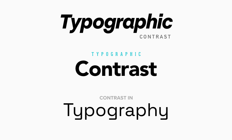
Using Size to Enhance Typography
Enhancing typography through the use of size can create a visually dynamic and engaging design. Size plays a crucial role in establishing typographic hierarchy and contrast. By strategically varying the font sizes, you can guide the reader’s eye and emphasize important information.
In terms of readability impact, larger font sizes are often used for headlines to grab attention and create visual interest. This contrast between the headline and the smaller supportive type helps to establish a clear hierarchy and improve the overall typographic design. The headline acts as a focal point, while the secondary information provides context and support.
Additionally, using different font sizes can create interesting typographic lockups. By combining sizes, you can evoke specific aesthetics and emotions, adding depth and personality to your design. It’s important to consider the visual elements and type choices to ensure that the contrast is effective and meaningful.
Creating Contrast With Color
Now let’s explore how color can be used to create striking contrast in typography, building on the impactful use of size discussed earlier. Color combinations play a crucial role in establishing visual hierarchy and enhancing the overall design. Color psychology, the study of how colors influence human emotions and behavior, can be leveraged to create contrast that resonates with the audience. Contrast in branding is achieved by carefully selecting colors that represent the brand’s values and personality. Additionally, considering accessibility and color contrast is important to ensure that the typography is easily readable for everyone. By using color combinations that have a high contrast ratio, text becomes more legible and accessible, especially for individuals with visual impairments. Understanding the principles of color theory and applying them effectively can make typography more impactful. Whether it’s using bold and vibrant colors against a neutral background or utilizing gradients to create depth, color can be a powerful tool in creating contrast and capturing attention. So, don’t underestimate the power of color in typography – it can truly elevate your design and make it stand out.
Utilizing Spacing for Contrast
Spacing is a powerful tool in typography, allowing for the creation of contrast and visual interest in your designs. By utilizing spacing techniques, you can have a significant impact on the overall look and feel of your typography. The way you space your letters and lines can create tension and draw attention to certain elements. Effective use of space can balance the visual weight of your typography, ensuring that no element overpowers the others.
When it comes to letter spacing, you have the opportunity to play with the placement of each character. By adjusting the spacing between letters, you can create different effects. For example, tight letter spacing can give a more compact and cohesive look, while loose letter spacing can create a more open and airy feel. Experimenting with different letter spacing options can help you find the right balance for your design.
In addition to letter spacing, the placement of your type also plays a role in creating contrast. Consider aligning your type in different ways, such as right justified or left justified, to create visual interest and tension. By strategically using space, you can guide the viewer’s eye and emphasize certain elements within your typography.
Ultimately, using space effectively in your typography is about finding the right balance. It’s about considering the visual weight of each element and ensuring that they work harmoniously together. By paying attention to spacing techniques, the impact of letter spacing, creating tension with placement, and balancing visual weight, you can create typography that is visually captivating and engaging.
Incorporating Shape for Typographic Contrast
To create dynamic and visually striking typography, you must harness the power of shape as a tool for typographic contrast. Shape refers to the use of different typefaces or altering the shapes of typographic elements. By utilizing typefaces, exploring decorative fonts, altering letter spacing, and combining serif and san serif, you can achieve a balance between legibility and style.
To illustrate the concept of incorporating shape for typographic contrast, consider the following examples:
| Shape Combination | Description |
|---|---|
| Serif + Sans Serif | Pairing a serif font with a sans serif font creates a contrast between the ornate and the clean, adding visual interest to your typography. |
| Decorative + Simple | Experimenting with decorative fonts in combination with simple fonts can create a striking contrast, allowing certain elements to stand out while maintaining legibility. |
| Altered Letter Spacing | Playing with letter spacing can create a unique visual effect. Increasing the spacing between letters can add a sense of elegance, while decreasing it can create a more compact and bold look. |
| Balancing Legibility and Style | It’s important to find a balance between legibility and style when incorporating shape for typographic contrast. While it’s essential to make your typography visually appealing, it should never sacrifice readability. |
Achieving a Balanced and Effective Contrast in Typography
When striving to create dynamic and visually striking typography, achieving a balanced and effective contrast is essential in order to captivate your audience with the power of shape and create a memorable design experience. Evaluating contrast techniques is crucial in achieving visual hierarchy and balancing type elements. By enhancing communication through contrast, you can guide the viewer’s attention and convey your message with clarity. It’s important to combine contrast techniques thoughtfully, ensuring that they work harmoniously to create a cohesive and impactful design.
To achieve a balanced and effective contrast, start by considering the different elements that can be manipulated, such as size, color, spacing, and shape. Experiment with varying font sizes to create hierarchy and contrast, using larger sizes to emphasize important information. Play with color combinations to enhance visual impact and guide the viewer’s eye. Utilize spacing techniques to create tension and visual interest, adjusting letter and line spacing to increase or decrease visual weight. Finally, experiment with different typefaces and font styles to create contrast and add visual interest to your typography.

