
It’s not just a coincidence. The secret lies in the typography structure. Understanding the anatomy of typography is like unlocking a hidden language that can greatly impact the effectiveness of your designs. From the stroke of a letter to the spacing between words, every element plays a vital role in creating visually appealing and easily readable typography. But it doesn’t stop there. By diving deeper into the world of typography structure, you’ll discover the principles that make typography truly shine, and uncover the art of manipulating typefaces to convey your message with precision and clarity. So, if you’re curious to explore the fascinating realm of typography structure and how it can transform your designs, buckle up and embark on this captivating journey.
Understanding Typography Anatomy
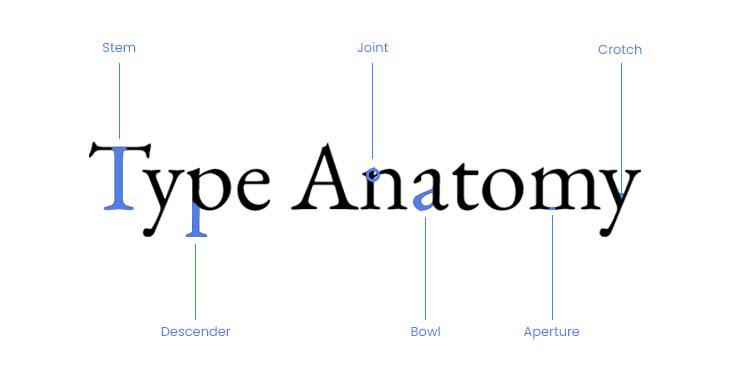
Understanding typography anatomy is crucial for anyone involved in the design and creation of typefaces and typographic compositions. Typography anatomy refers to the visual elements that make up the letterforms in a typeface. These elements include the spine, stem, and stroke, among others. Type designers carefully craft these components to determine the overall look and readability of a typeface.
To better understand typography anatomy, it is important to familiarize yourself with letterform components, typeface classifications, typographic measurements, and type anatomy details. Letterform components include the spine, stem, and stroke, which contribute to the overall structure of a letter. Typeface classifications, such as serif, sans-serif, script, and display, help categorize different typefaces based on their design characteristics. Typographic measurements, like point, pica, leading, kerning, and tracking, provide precise measurements for letter and line spacing.
Understanding the details of type anatomy, such as the aperture, ascender, descender, bowl, cap height, and baseline, allows designers to create well-crafted and visually appealing typography. These details guide readers’ eyes along the letterforms and contribute to the overall legibility and readability of the typeface.
Exploring Different Typography Types
Now let’s embark on a captivating journey into the diverse world of typography, where we will uncover the intricacies and nuances of different typography types. Exploring typography styles allows us to delve into the vast array of options available to us. From serif fonts with their small lines or strokes attached to the ends of the main strokes, to sans-serif fonts that have a cleaner and more modern look without those additional lines or strokes. There are also decorative fonts that offer unique and distinctive designs, often deviating from traditional letterforms.
Understanding typography anatomy basics is essential in appreciating the different typography types. Each letterform consists of components such as the spine, stem, and stroke, which are carefully crafted by type designers to determine the overall look and readability of a typeface.
Typography has a psychological impact, and it plays a crucial role in branding and digital media. The choice of typography can evoke specific emotions and convey a particular message. In branding, typography helps establish an identity and create a recognizable visual presence. In digital media, typography is crucial for readability and user experience.
As we explore different typography types, we will discover how they can be effectively used for branding purposes and how they play a significant role in digital media. So, let’s dive into the world of typography and uncover the power and versatility that different typography types possess.
The Significance of Typography
Typography holds immense significance in the world of design and communication, as it has the power to shape perception, evoke emotions, and convey messages with precision and creativity. The impact of typography on user experience is undeniable, as it plays a crucial role in creating a first impression and influencing how users engage with a design. In branding, typography is essential for establishing a brand’s identity and conveying its values and personality. Typography in web design helps guide users through the interface, making information easily accessible and enhancing the overall user experience. In print media, typography is used to create visually appealing layouts, capture attention, and communicate information effectively. Additionally, typography in advertising is instrumental in capturing the audience’s attention, conveying the intended message, and creating a memorable brand experience. Whether it’s in branding, web design, print media, or advertising, the right typography can make a significant difference in how a design is perceived and how it resonates with its intended audience.
Key Principles of Typography
Typography, being an integral part of design and communication, demands a deep understanding of the key principles that govern its effectiveness and impact. When it comes to creating visually appealing and well-structured typography, there are several important principles to keep in mind: typography hierarchy, typography contrast, typography alignment, typography spacing, and typography styling.
Typography hierarchy refers to the use of variations in size, weight, and style to establish a clear visual order. This helps guide the reader’s eye and emphasizes important information. Typography contrast involves combining different typefaces, sizes, weights, and colors to add visual interest and differentiate between levels of information. Contrast helps create a dynamic and engaging typographic composition.
Typography alignment is crucial for organizing and visually aligning type. Whether it’s left-aligned, right-aligned, centered, or justified, proper alignment adds clarity and professionalism to the overall design. Typography spacing, including leading, kerning, and tracking, is essential for ensuring readability and preventing overcrowding or excessive gaps between letters and lines.
Lastly, typography styling involves understanding and utilizing various typography terminology, decorative styles, and font pairing techniques. By incorporating these principles into your typographic design, you can create visually appealing and highly effective communication pieces.
Styling and Manipulating Typography
To enhance the visual impact and effectiveness of your typographic design, it is essential to master the art of styling and manipulating typography. By understanding the various techniques and principles of typography, you can create stunning and compelling designs that captivate your audience. Here are five key aspects to consider when styling and manipulating typography:
- Typographic Effects: Explore different effects such as drop shadows, embossing, or gradients to add depth and dimension to your typography.
- Font Pairing: Experiment with different font combinations to create visual interest and establish a harmonious relationship between different typefaces.
- Decorative Typography: Incorporate decorative elements, such as flourishes or ornaments, to add a unique and artistic touch to your typography.
- Typography Hierarchy: Use variations in size, weight, and style to establish a clear visual hierarchy and guide the viewer’s attention to the most important information.
- Typography Spacing: Pay attention to the spacing between letters, words, and lines to ensure readability and create a visually balanced composition.
The Role of Typeface Selection
Choosing the right typeface is crucial in creating a visually impactful and effective design. The role of typeface selection goes beyond aesthetics; it has a significant impact on font psychology, branding, user experience, readability, and overall design composition.
The influence of typeface on user experience is undeniable. Different typefaces evoke different emotions and associations, which can greatly affect how users perceive and interact with a design. For example, a bold and modern sans-serif typeface may convey a sense of professionalism and innovation, while a classic serif typeface may evoke a feeling of elegance and tradition.
Typography plays a vital role in branding. The choice of typeface can help establish a brand’s identity and convey its values and personality. Consistency in typography across various brand touchpoints, such as websites, packaging, and advertisements, helps build brand recognition and trust.
The connection between typography and readability is essential for effective communication. The legibility of a typeface and its ability to be easily read and understood greatly impact how readers engage with the content. Proper font pairing and spacing, as well as considering factors like x-height and line spacing, can significantly improve readability.
Font pairing is another crucial aspect of typeface selection. Combining complementary typefaces can create visual interest, hierarchy, and contrast in a design. Pairing a decorative headline font with a simple and legible body font can create a harmonious balance and enhance the overall design’s impact.
To illustrate the impact of typeface selection, consider the following table:
| Typeface | Font Psychology | Role in Branding | Influence on User Experience | Connection to Readability | Importance of Font Pairing |
|---|---|---|---|---|---|
| Serif | Elegance, | Heritage, | Evokes a sense of | Enhances readability | Complementary typefaces |
| tradition | sophistication | professionalism | add visual interest | ||
| ———– | —————– | —————– | —————————– | ————————– | —————————- |
| Sans-serif | Modern, | Innovation, | Creates a clean and | Easy to read | Contrasting typefaces |
| simplicity | professionalism | contemporary look | create visual hierarchy | ||
| ———– | —————– | —————– | —————————– | ————————– | —————————- |
| Script | Elegance, | Luxury, | Adds a sense of | Requires careful | Contrasting script and |
| sophistication | exclusivity | hand-crafted quality | consideration for | sans-serif typefaces | |
| ———– | —————– | —————– | —————————– | ————————– | —————————- |
| Display | Playfulness, | Creativity, | Grabs attention and | May have lower | Contrast with other |
| uniqueness | originality | creates a memorable | readability depending | typefaces for emphasis | |
| visual impact | on design |
Understanding the impact of typeface selection is crucial for designers to create visually appealing, effective, and engaging designs. By considering font psychology, branding, user experience, readability, and font pairing, designers can make informed decisions that enhance the overall design’s impact and message.
Mastering Typography Structure
Mastering the structure of typography unlocks the creative potential and precision necessary for captivating and visually appealing designs. To help you on your journey to becoming a typography master, here are some key elements to focus on:
- Typography Hierarchy: Understand how to establish a clear visual order by using variations in size, weight, and style. This will guide the viewer’s eye and highlight important information.
- Typographic Measurements: Familiarize yourself with measurements like point, pica, leading, kerning, and tracking. These precise measurements ensure readability and prevent overcrowding or excessive gaps between letters and lines.
- Typography Styling Techniques: Learn about styling techniques such as bold and italic, font pairing, and the use of different typeface families. These techniques allow you to convey different tones and messages through your typography.
- Typography in Digital Media: Recognize the unique considerations for typography in digital media, such as responsive design and optimizing legibility across various devices and screen sizes.
- Importance of Typography in Branding: Understand that typography plays a crucial role in branding and can help establish a brand’s identity and personality. Consistent and well-designed typography creates a memorable and cohesive brand experience.

