
Just like the perfect spacing between words is like the air between musical notes, the spacing for typography is crucial for creating visually appealing and legible designs. But what exactly is the spacing for typography? How can it be adjusted to enhance the overall appearance and communication of text? In this discussion, we will uncover the secrets behind effective typography spacing and reveal the techniques used to achieve harmonious and impactful designs. So, get ready to unlock the mysteries of spacing in typography and discover the art of creating captivating visual compositions.
Importance of Spacing in Typography
The importance of spacing in typography cannot be overstated, as it plays a crucial role in enhancing readability and conveying meaning to the reader. Proper spacing ensures that the text is legible and easy to understand. Negative tracking, or adjusting the space between letters, is one technique that helps achieve optimal character spacing. It allows for a balanced and visually appealing layout. Similarly, kerning techniques are used to fine-tune the spacing between specific characters, ensuring that they are visually balanced and harmonious. The impact of leading, which refers to the space between lines of text, should not be underestimated. It influences the overall appearance and readability of the text. Different font styles may require different spacing adjustments to maintain legibility and visual cohesion. For example, condensed typefaces may require closer tracking and tighter leading to maintain intimacy and readability. In contrast, lowercase letters with large font sizes may benefit from negative tracking to compensate for the extra space between letters. It is important to experiment with different spacing techniques and adjust them accordingly to create visually pleasing and readable typography.
Kerning and Its Significance
Achieving optimal character spacing is crucial in typography, and one technique that plays a significant role in this is kerning. Kerning refers to the adjusted spacing between specific characters, and it is used in various design elements such as logos, posters, and headlines. Here are three key aspects to understand about kerning:
- Kerning techniques: Kerning involves adjusting the space between letters to create a visually balanced and harmonious text. Designers use normal kerning as a basis and then make adjustments to individual letters to ensure proper spacing.
- Common kerning mistakes: Poor kerning can negatively impact readability and aesthetics. Some common mistakes include letters running into each other, ligatures forming unintentionally, and tight kerning altering the meaning of the text. It is essential to avoid these errors and maintain legibility.
- Kerning in logo design and typography: Kerning plays a crucial role in creating visually appealing logos and typography. It helps to create a cohesive and balanced design, enhancing readability and overall impact. Designers carefully consider kerning to ensure that the spacing between letters complements the overall design concept.
Understanding kerning techniques, avoiding common mistakes, and utilizing it effectively in logo design and typography are essential for achieving optimal character spacing and enhancing readability in your designs.
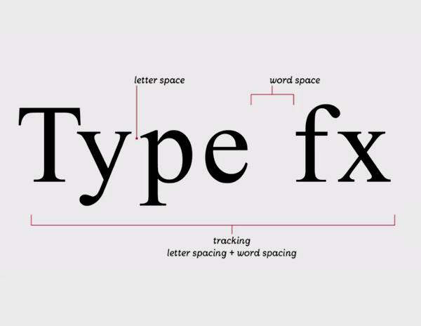
The Role of Word Spacing
To ensure clear and cohesive communication, proper word spacing is crucial in typography. The role of word spacing goes beyond simply separating words; it impacts the overall readability and visual appeal of the text. Let’s debunk some common misconceptions about word spacing and explore effective techniques for achieving optimal spacing.
One way to understand the importance of word spacing is to consider its impact on logos and headlines. In logos, spacing plays a key role in creating a harmonious and balanced design. It helps to define the relationship between letters and shapes, contributing to the overall aesthetic appeal. Similarly, in headlines, proper word spacing enhances the visual impact and legibility of the text, helping to grab the reader’s attention.
Now, let’s take a closer look at some word separation techniques that can be employed in typography. The goal is to strike a balance between over-separation and under-separation. Over-separation can cause distractions and shift focus away from the words themselves, while under-separation can lead to misunderstandings and make the text harder to read.
One commonly used technique is the application of justification, which aligns the spaces between words to create a neat and organized appearance. However, it is important to use justification carefully, as misuse can result in arbitrary and incorrect spacing.
Understanding Leading in Typography
Understanding leading in typography is essential for creating visually appealing and readable text. Leading refers to the space between lines of text, and it plays a crucial role in the overall design and readability of the content. Here are some key points to understand about leading in typography:
- Leading adjustment techniques: Leading can be adjusted to improve the readability and visual appeal of the text. By increasing or decreasing the space between lines, you can create a more harmonious layout.
- Leading and readability: Proper leading helps in improving the readability of the text. It ensures that the lines are not too close together, making it easier for the reader to follow along.
- Leading in different font styles and design projects: Different font styles may require different leading adjustments. For example, a font with taller ascenders and descenders may need more leading to avoid clashes between lines. Additionally, leading can vary depending on the design project, such as headlines requiring tighter leading for a distinct effect.
- Leading in relation to font size: The size of the font can also affect the leading. Larger fonts may need more leading to ensure proper spacing, while smaller fonts may require less leading to avoid excessive gaps between lines.
Understanding and implementing appropriate leading adjustments is crucial for creating well-designed and readable typography. By paying attention to leading, you can enhance the overall aesthetics and legibility of your text in various design projects.
Adjusting Leading Using Software
When adjusting leading in typography using software, you can utilize tools such as Adobe InDesign, Illustrator, or Photoshop. These leading software tools provide various options for adjusting the spacing between lines of text. To make leading adjustments, you can use the Character panel in these software programs. By default, the leading setting in most font software is 120% of the type size. However, you can easily modify the leading value in the Character panel by selecting the text box and choosing a value from the drop-down menu. Additionally, you can use keyboard shortcuts by holding down the option or alt key and pressing the up or down arrow keys to adjust leading. It is important to follow leading best practices to ensure readability in your design projects. For body copy, start with a leading value that is at least 2 points above the text’s height, but be cautious not to use too much leading, as it can make the body copy harder to read. Different typefaces may require different leading adjustments, especially those with shorter x-heights or longer ascenders and descenders. Lastly, when using colors other than black text on a white background, increase leading and consider using a lighter weight of the typeface for better legibility.
Using Different Line Spacing for Typefaces
Different typefaces may require varying amounts of line spacing to enhance legibility and readability. When it comes to line spacing for different font styles, it’s important to consider the impact it can have on readability. Here are three key points to keep in mind:
- Line spacing for headlines: Headlines create hierarchy and should be distinct from the body copy. Using tighter leading (~2 pts or less) can help create a distinct effect and make headlines stand out.
- Adjusting line spacing in paragraph text: Typefaces with shorter x-heights may appear to use less space, while typefaces with taller x-heights, like Helvetica Neue, may require more leading to enhance legibility. Additionally, longer ascenders and descenders in typefaces often need more leading.
- Line spacing in captions: Captions are typically smaller and require careful line spacing to ensure legibility. It’s important to strike a balance between enough spacing to make the text readable but not too much that it becomes overwhelming.
Leading Considerations for Colorful Text
To ensure legibility and readability when working with colorful text, it is important to consider the appropriate leading for each typeface and color combination. Leading, the space between lines of text, plays a crucial role in design and can significantly impact the legibility of colorful text. When using colors other than black text on a white background, increasing leading is recommended to enhance legibility. The increased leading helps to compensate for the potential decrease in contrast caused by the use of lighter colors or dark backgrounds. Additionally, using a lighter weight of the typeface can further improve legibility in these situations.
In headers and headlines, designers often opt for tighter leading to create a distinct effect and emphasize hierarchy. Negative leading, around 2 points or less, can be used in headers with multiple lines to achieve this desired effect. By adjusting the leading in headers, designers can make them visually distinct from the body copy.
Tighter Leading in Headlines
For a distinct effect and emphasized hierarchy in your headlines, consider using tighter leading. Experimenting with negative leading, where the space between lines is reduced to approximately 2 points or less, can create a unique and eye-catching visual impact. Here’s why you should consider tighter leading in your headlines:
- Distinct headlines: Tighter leading helps separate your headlines from the body copy, making them stand out and grab attention.
- Leading hierarchy: By adjusting the leading in your headlines, you can create a clear visual hierarchy within your design, guiding the reader’s eye and emphasizing important information.
- Leading experimentation: Trying different leading heights in your headlines allows you to explore various visual effects and find the most legible option for your design project.
When using tighter leading in your headlines, it’s important to strike a balance between visual impact and readability. Be mindful of the font, font size, and the overall design composition to ensure that your headlines remain clear and easy to read. So, don’t be afraid to experiment with leading in your design projects to create distinct and attention-grabbing headlines.

