
How does it impact the legibility and overall visual appeal of a text? In this discussion, we will explore the concept of line-height and its significance in typography. You will discover how different line-heights can create distinct tones and moods within a design, and we will delve into the various factors that influence the optimal line-height for different contexts. By the end of this discussion, you will gain a deeper understanding of the role line-height plays in typography and how to achieve the perfect balance for your own designs.
Importance of Line-Height in Typography
To enhance the legibility and readability of your typography, it is crucial to understand the importance of line-height. Line height plays a significant role in shaping the user experience, as it directly impacts how people interact with your text. The psychology of line height is rooted in the way our brains process information. A well-considered line height can enhance legibility by creating the right amount of space between lines, making it easier for readers to follow along. By adjusting the line height, you can also establish a visual hierarchy within your text, guiding readers through the content and highlighting important information. Line height is not just a technical aspect of typography; it has the power to influence the overall branding of your design. By carefully choosing the appropriate line height, you can create a consistent and cohesive visual identity that aligns with your brand. So, when it comes to typography, remember that line height is more than just a spacing adjustment – it is a crucial element that impacts user experience, legibility, visual hierarchy, and branding.
The Relationship Between Line-Height and Readability
Enhancing the legibility and readability of your typography requires understanding the relationship between line-height and readability. Line height, also known as line spacing, plays a crucial role in determining how easily your text can be read and understood. It affects not only the aesthetics of your design but also the user experience.
When it comes to the legibility of your text, line height plays a significant role. The right amount of line spacing ensures that each line is distinct and easy to follow. Too little line height can result in cramped and crowded text, making it difficult for readers to navigate through the content. On the other hand, too much line height can make the lines visually float away from each other, causing vertical scanning to become challenging.
Line height also contributes to the visual hierarchy within your typography. By adjusting the spacing between lines, you can create a clear distinction between different sections or elements of your text. This helps guide readers’ eyes and highlights important information, improving overall readability.
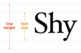
Furthermore, line height impacts the overall aesthetics of your design. The right balance between line height and font size ensures that your text appears visually pleasing and harmonious. It creates a sense of rhythm and flow, making your typography more engaging and inviting to read.
Factors to Consider When Setting Line-Height
When determining the appropriate line-height for your typography, there are several factors that you should take into consideration. Line height plays a crucial role in establishing visual hierarchy, improving legibility, enhancing user experience, and ensuring accessibility. Let’s explore these factors further:
- Visual Hierarchy: Line height can be used strategically to create visual distinctions between different elements of your typography. By adjusting the line height, you can emphasize headings, subheadings, and body text, guiding the reader’s eye and enhancing the overall hierarchy of your design.
- Line Length: The length of your lines of text can impact the readability of your typography. When lines are too long, readers may have difficulty tracking from one line to the next. Conversely, when lines are too short, the text may appear fragmented and disjointed. Adjusting the line height can help mitigate these issues and improve the overall reading experience.
- Legibility: Line height directly influences the legibility of your typography. By increasing the space between lines, you can enhance readability and reduce the likelihood of words blending together. Conversely, decreasing the line height too much can make the text feel cramped and challenging to read.
- User Experience: Line height plays a crucial role in creating a positive user experience. By ensuring that your typography is easy to read and navigate, you can engage your audience and encourage them to interact with your content. Consider the needs and preferences of your target audience when setting the line height.
- Accessibility: Line height is an essential consideration for ensuring accessibility in your typography. By providing sufficient space between lines, you can accommodate users with visual impairments or reading difficulties. Additionally, consider using adjustable line height options to allow users to customize their reading experience.
To summarize, when setting the line height for your typography, consider the visual hierarchy, line length, legibility, user experience, and accessibility. By carefully considering these factors, you can create typography that is visually appealing, easy to read, and accessible to a wide range of users.
| Factors to Consider When Setting Line-Height |
|---|
| Visual Hierarchy |
| Line Length |
| Legibility |
| User Experience |
| Accessibility |
Best Practices for Choosing Line-Height
Choosing the appropriate line-height is essential for creating visually appealing and readable typography. The line-height you choose can have a significant impact on the overall user experience of your website or design. Here are some best practices to consider when choosing line-height:
- Line height and user experience: The line height you choose can greatly affect how users interact with your text. A well-spaced line height can make reading more comfortable and enjoyable, enhancing the overall user experience.
- Line height and visual hierarchy: Line height plays a crucial role in establishing a visual hierarchy within your typography. By adjusting the line height, you can create emphasis and guide the reader’s eye to important information.
- Line height and accessibility considerations: It’s important to consider accessibility when choosing line-height. Opting for a slightly larger line height can improve readability for users with visual impairments or reading difficulties.
- Line height and branding consistency: Consistency is key when it comes to branding. Choosing a line height that aligns with your brand guidelines ensures a cohesive and recognizable visual identity.
- Line height and cross-platform compatibility: With the increasing number of devices and screen sizes, it’s important to choose a line height that works well across different platforms. Testing your typography on various devices can help ensure a consistent reading experience for all users.
How Line-Height Affects Vertical Scanning
To understand the impact of line-height on vertical scanning, let’s explore how the spacing between lines influences the way users navigate and absorb information on a webpage. The psychology of line height in visual perception reveals that the distance between lines can affect how users engage with the content. A tight line height can hinder horizontal eye movement and encourage scanning down the left edge, making it difficult for users to absorb information in a structured manner. On the other hand, a loose line height can cause lines of text to visually float away from each other, making vertical scanning challenging. Finding the right balance is crucial for optimal vertical scanning effectiveness.
Exploring the aesthetics of line height in typography can provide insights into its impact on user engagement. Case studies on line height and user engagement have shown that an appropriate line height can create a sense of hierarchy in design, guiding users’ attention and facilitating information absorption. By adjusting the line height, designers can enhance readability and improve the overall user experience.
The Role of Line-Height in Responsive Web Design
Line-height plays a critical role in ensuring optimal readability and user experience in responsive web design. It affects various aspects of web typography and has a significant impact on how users interact with the content. Here’s why line-height is important in responsive web design:
- Line height and user experience: The appropriate line height can enhance the reading experience by providing enough breathing space between lines, making the text more comfortable to read. It prevents the text from feeling cramped or overwhelming.
- Line height and accessibility: Adequate line height is essential for accessibility, as it improves legibility for users with visual impairments or reading difficulties. It allows for better distinction between lines, making the content more accessible to a wider audience.
- Line height and visual hierarchy: Line height can contribute to establishing a clear visual hierarchy on a webpage. By adjusting the line spacing, designers can create a distinction between different sections of text, helping users navigate and understand the content more easily.
- Line height and responsive typography: In responsive web design, line height becomes even more crucial. It needs to adapt to different screen sizes and resolutions to maintain readability across devices. Proper line spacing ensures that the text remains legible and visually appealing on both small and large screens.
- Line height and line spacing: The right line height also affects the overall line spacing, which determines the vertical rhythm of a webpage. Consistent line spacing creates a harmonious flow and improves the overall aesthetics of the design.
Tips for Achieving the Perfect Line-Height in Typography
When it comes to achieving the perfect line-height in typography, one key tip is to consider the overall visual balance of your text. Line height plays a crucial role in enhancing legibility, visual hierarchy, user experience, and accessibility. To ensure legibility, it is important to find the right balance between line height and font size. If the line height is too tight, it can make the text appear cramped and difficult to read. On the other hand, if the line height is too loose, the lines of text can visually float away from each other, making it challenging for readers to scan vertically.
In terms of visual hierarchy, adjusting the line height can help create a clear distinction between different sections of text, making it easier for users to navigate and comprehend the content. Additionally, the line height impacts the overall user experience by influencing the readability and flow of the text. A well-optimized line height can provide a comfortable reading experience, preventing eye strain and fatigue.
Moreover, line height is also critical for ensuring accessibility. By setting an appropriate line height, you can improve readability for individuals with visual impairments or reading difficulties. Lastly, line height and line spacing go hand in hand. By adjusting the line height, you can effectively control the spacing between lines, which further contributes to the overall readability and aesthetics of your typography.

