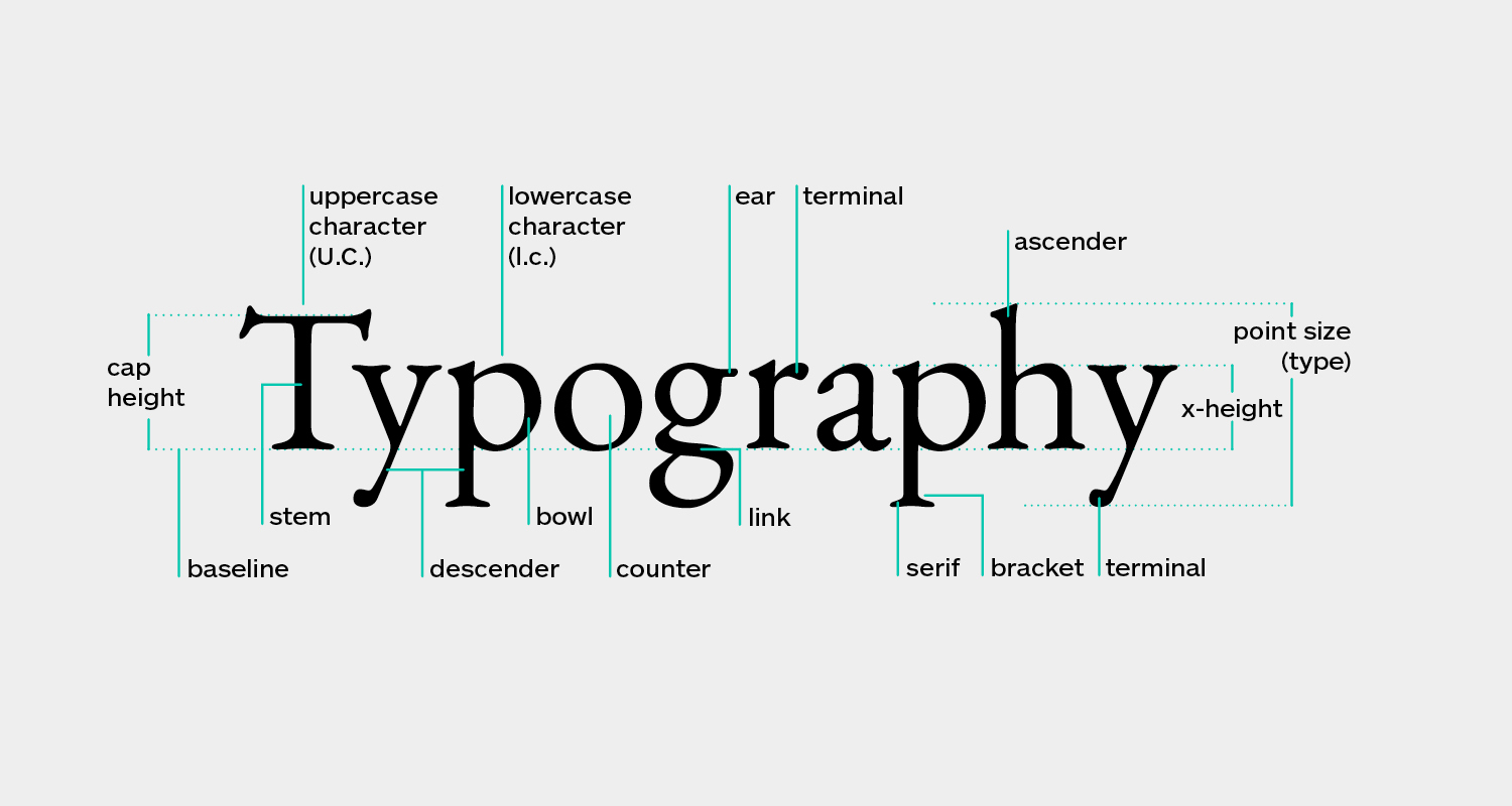
If you want to create visually appealing designs that captivate your audience, understanding the key principles of typography is crucial. From paying attention to kerning and avoiding stretching typefaces to choosing the right alignment and creating a hierarchy, these principles hold the key to creating clutter-free and effective designs. But that’s not all, we will also explore the importance of minimalism, white space, and how to convey your message through typography. So, if you’re ready to take your typography skills to the next level and unlock the secrets of impactful design, let’s embark on this journey together.
Importance of Kerning and Spacing
Kerning and spacing play a crucial role in the legibility and aesthetic appeal of typography. When it comes to typography mistakes, neglecting the impact of spacing can lead to design blunders. The way letters are spaced can greatly affect the readability of a text. To ensure optimal legibility, here are some kerning tips to keep in mind. First, pay attention to letter combinations that may appear too close or too far apart. Adjusting the spacing between these letters can create a more harmonious flow. Second, strive for rhythm and consistency in letter spacing throughout your design. This will create a cohesive and visually pleasing result. Additionally, don’t forget to consider the spacing between words. Adequate spacing between words can significantly improve the overall readability. Lastly, when it comes to font pairing, be mindful of the spacing between the letters of different typefaces. The right balance can enhance the contrast and impact of your typography. By paying attention to spacing and kerning, you can avoid typography mistakes and ensure the readability factors of your design are on point.
Avoiding Typeface Stretching
To maintain the integrity and intended purpose of a typeface, it is essential to avoid stretching it beyond its original design. Typeface stretching not only distorts the visual appeal of the font but also diminishes its legibility and impact. Here are three reasons why avoiding typeface stretching is crucial in expanding your typography knowledge:
- The Impact of Font Styles: Typeface stretching disrupts the visual harmony of font styles. Each typeface is carefully crafted with specific proportions and weights to convey a particular tone or message. By stretching a typeface, you alter its intended style, compromising its effectiveness in delivering the desired impact.
- The Role of White Space: White space is an essential element in typography. It provides breathing room for the text, improving readability and overall aesthetic appeal. Stretching a typeface reduces the availability of white space, leading to crowded and cluttered designs that are challenging to read and comprehend.
- The Influence of Typography on Brand Identity: Typography plays a significant role in shaping a brand’s identity. Consistency in font usage helps establish brand recognition and convey a cohesive message. By stretching a typeface, you risk diluting the brand’s visual identity and undermining its credibility.
To maximize the impact of typography and create visually appealing designs, it is essential to respect the original design of typefaces and avoid stretching them. By doing so, you ensure the legibility, aesthetic appeal, and overall effectiveness of your typographic choices.
Choosing the Right Alignment
Choosing the right alignment for your typography is crucial in creating a visually appealing and effective design. Different alignment options can have a significant impact on the overall aesthetics and readability of your text. Let’s explore some of the key aspects of alignment in typography:
- The impact of center alignment: While center alignment may seem visually pleasing, it can be challenging to read, especially for longer blocks of text. It is often best reserved for specific design elements, such as headlines or quotes.
- The role of left alignment in readability: Left alignment, also known as flush left alignment, is the most commonly used alignment in typography. It provides a clean and organized appearance, making it easier for readers to follow the text. This alignment is commonly seen in books, magazines, and websites.
- The use of right alignment in specific design elements: Right alignment, also known as flush right alignment, can be used to create visual interest and variety in your design. It is often used for elements such as captions or sidebars.
- Exploring justified alignment in typography: Justified alignment evenly spaces the text between the left and right margins. While it can create a clean and polished look, it can also result in uneven word spacing, which may affect readability. It is important to use justified alignment with caution and consider its impact on legibility.
- The influence of asymmetrical alignment in design aesthetics: Asymmetrical alignment, also known as ragged right alignment, can create a sense of movement and energy in your design. It allows for more natural variation in word spacing, resulting in a visually interesting layout. However, it is important to maintain a balanced and harmonious composition to ensure readability.
Consider experimenting with different alignment options to find the one that best suits your design and enhances the overall message you want to convey. Each alignment choice has its own unique qualities, and understanding their impact will help you create typography that is both visually pleasing and highly readable.
Utilizing Contrasting Fonts
Contrasting fonts can add visual interest and enhance the overall design of your typography. By utilizing different typefaces that complement each other, you can create a dynamic and engaging composition. Here are three reasons why utilizing contrasting fonts is important in typography:
- Typography effects: Contrasting fonts allow you to experiment with different styles, weights, and decorative elements. This gives you the opportunity to create unique typography effects that catch the viewer’s attention and make your design stand out.
- Readability tips: Choosing a primary font that is easy to read and pairing it with a contrasting secondary font can improve readability. The combination of fonts can help guide the reader’s eyes and make the text more legible, especially for longer passages of content.
- Typography for branding: When used strategically, contrasting fonts can reinforce your brand identity and create a memorable visual representation. By selecting fonts that align with your brand’s personality and values, you can establish a strong and cohesive brand image.
Incorporating contrasting fonts into your design also allows you to play with white space in design. The negative space between the fonts can create balance and add a sense of elegance to your typography. So, don’t be afraid to experiment with different font combinations and unleash your creativity in typography design.
Conveying Messages With Font Sizes
When designing with typography, font sizes can be used strategically to convey messages and capture the reader’s attention. The size of a font can dictate the importance of certain information and guide the reader’s focus. In promotional typography, larger and bolder fonts can be used to highlight key messages and create visual impact. This technique is particularly effective in advertisements, where the goal is to grab the viewer’s attention quickly. On the other hand, minimalistic typography often utilizes smaller and more subtle font sizes to create a clean and elegant design. This approach emphasizes simplicity and allows the message to speak for itself. Additionally, the utilization of white space in typography is crucial for readability and legibility. By leaving enough space between letters and paragraphs, the text becomes easier to read and visually appealing. The proper use of font sizes, in combination with white space, can greatly enhance the overall design and effectively convey the desired message. It is important to consider the principles of typography when selecting font sizes to ensure that the message is communicated clearly and effectively.
Establishing a Clear Hierarchy
To effectively convey your message through typography, it is crucial to establish a clear hierarchy in your design. A clear hierarchy ensures that your audience can easily navigate and understand the information presented. Here are three important tips to help you establish a clear hierarchy in your typography:
- Use proper kerning techniques: Kerning is the adjustment of spacing between individual letters. Pay attention to the spacing between letters to ensure readability and visual balance. Avoid overcrowding or too much spacing between letters, as it can affect legibility.
- Prioritize readability: Choose typefaces that are easy to read, especially for body text. Consider factors such as font size, line length, and contrast between the text and background. Readability is essential for ensuring that your message is easily understood by your audience.
- Embrace whitespace benefits: Whitespace, also known as negative space, is the empty space between elements in your design. It helps create visual breathing room and improves legibility. Utilize whitespace strategically to separate different sections of your design and guide the reader’s eyes to important information.
Experimenting With Typography Effects
Typography effects offer a multitude of creative possibilities to enhance your design. With typography experimentation, you can explore unique typography styles and create visual appeal in typography. By experimenting with different font styles, such as decorative or handwritten fonts, you can add a touch of creativity to your design. Consider using typography effects like drop shadows, gradients, or texture overlays to give your typography a unique and visually captivating look. Don’t be afraid to combine typography with other design elements, such as illustrations or photographs, to create a cohesive and eye-catching design. Test out different effects to find the ones that best complement your message and overall design aesthetic. Remember, typography creativity is about pushing the boundaries and finding innovative ways to communicate visually. So, let your imagination run wild and see where it takes you in the realm of typography effects.


